| Back to... |
Share Our Stories! - Click Here |
Bad Math As A Mass Propaganda And Sales Tool |
From
GlobalIntel |
Its no surprise that the largest employer of mathematicians in the United States is the National Security Agency. These jobs are not all codebreakers why does the NSA employ so many mathematicians, second only to Wall St.? The biggest secret propaganda and sales tool used by experts in the modern world is the deliberate twisting and false presentation of data, specifically numbers and statistics. They do so in such a subtle way, that the argument leads into a heated debate about the inference of the obvious conclusions NOT the calculation of the numbers themselves! Very rarely are the methods of statistical calculations, data collection, formulations, and other operations ever questioned. This is used by governments, to paint a picture they want, in the case of the military, to sell war as outlined eloquently by mathematician Nassim Taleb:
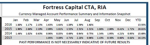
(In case you haven't heard of Nassim Taleb this book is a MUST READ as a primer for any trader or investor to understand MATH as it pertains to the MARKETS: Fooled by Randomness: The Hidden Role of Chance in Life and in the Markets. Taleb is no academic he runs a multi-billion dollar hedge fund). Inflated numbers of enemy casualties, or deflated numbers of aggressor casualties, pose an obvious example of why such agencies would use bad math to display data in such a way as to further their argument, for one side or another. But what other examples? Why would Wall St. use such a strategy, considering their entire business is numbers? Consider the example of the Fed and interest rate policy. If the current interest rates are 1%, and the Fed hikes to 2%, thats a 1% increase but in percentage terms, its a 100% increase! If you had interest rate derivatives, you could with no leverage potentially earn a 100% return on your money, in a day (supposing it was a surprise and the market wasnt already pricing in the hike). Another popular statistical misconception, is that of loss recovery. Recovering from a loss is not linear. For example, if your fund has a 10% loss, you need 11.11% just to break even. This becomes more extreme, the deeper the loss hole. If you start with 100 units, lose 10% of them you have 90. But to increase from 90 back to your original starting 100, you need 11.11 units, which is 11% just to get back your lost 10 units. Yes! And speaking about performance, lets knock the industry standard performance capsule and its big gaping hole. According to most reporting standards, such as prescribed by NFA, FINRA, and many others funds report monthly performance based on a snapshot of performance during that month. This sounds reasonable until you actually calculate monthly performance numbers and see that its really only performance based on a 1 or 2 day period intra-month. If there was a big profit or a big loss on the days taken as snapshots thats what will show in the capsule.
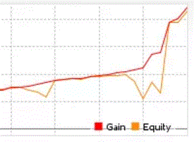
Whats misleading about this, it doesnt represent to investors what happened DURING the month. For many strategies, this is not relevant but for some strategies, it is very relevant. For example, imagine a scenario where there was a huge 30% loss and then recovery, and the month ended up being 2% positive. It would seem to be a low-volatility fund, and likely attract conservative investors, like Pension funds. They wouldnt know about the intra-month risk, unless the manager told them (but why would they, its not in the required documents, and maybe THEY dont even know about it). However you add it up, the difference between balance and equity can be misleading. Skipping the monthly performance capsules that 99% of Wall St. uses, if one has access to it, one can compare the balance and equity curves over time. For those who dont know, balance is closed positions, equity includes live trades. So if a position is still open, the floating profit or loss will show up in the equity. Take a look at this discrepancy:
The red line is the balance, yellow/orange line is the equity. These lines must separate when trades are placed, otherwise an account would never lose or gain. But how wide are these gaps, how frequent are they? Absent of rigorous statistical analysis as done by Taleb in his war casualties paper, comparing these 2 lines is the most basic form of drawdown analysis. What caused the lines to diverge? What dates did they diverge on, and what forces caused them to converge? These are questions astute investors should be asking. For a full education on statistical analysis, checkout Fortress Capitals Introduction to Foreign Exchange. For a pocket guide designed to make you a due diligence expert, checkout Splitting Pennies Understanding Forex for only $6.11 on kindle, or get some awesome financial books here. |
| Donate to Rense.com Support Free & Honest Journalism At Rense.com | Subscribe To RenseRadio! Enormous Online Archives, MP3s, Streaming Audio Files, Highest Quality Live Programs |